#types of spells
Explore tagged Tumblr posts
Text
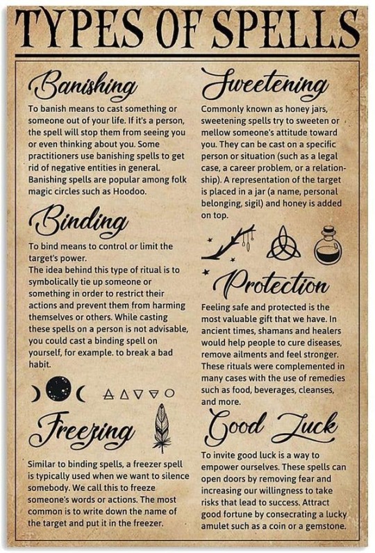
97 notes
·
View notes
Text

🖤✨
#types of spells#spells#lunar witch#green witch#witchyvibes#gemini#witchy blog#magic#witchcraft#baby witch
14 notes
·
View notes
Text
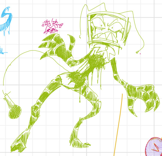
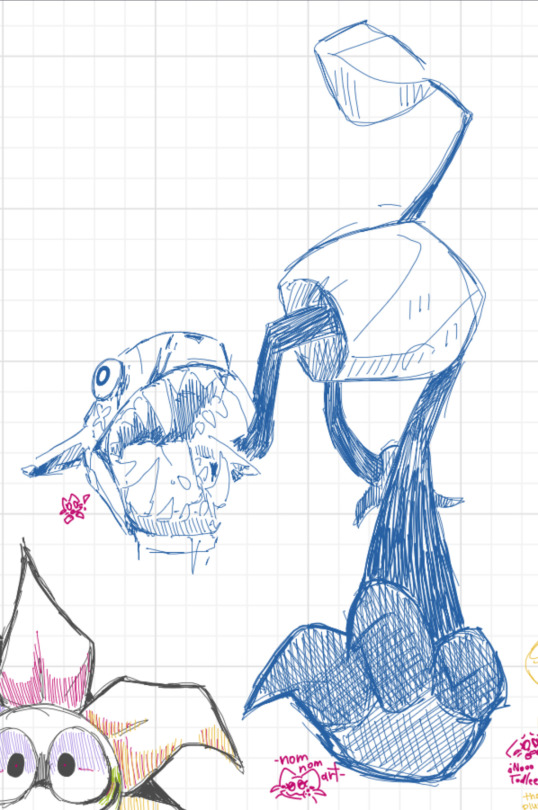
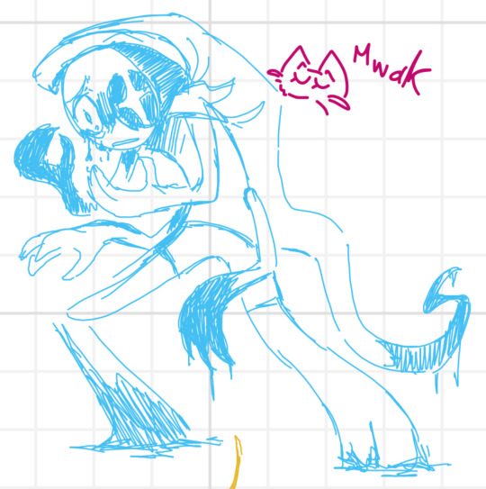
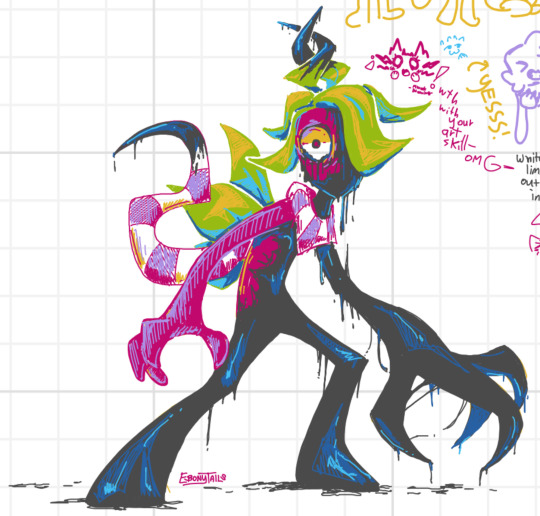
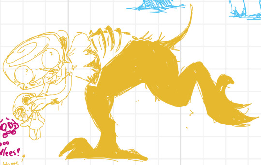
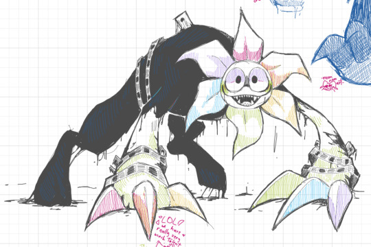
Twisted Whiteboard doodles!
#dandys world#dandy’s world#twisted astro#twisted sprout#twisted shelly#twisted pebble#twisted dandy#twisted vee#dandys world astro#dandys world sprout#dandys world shelly#dandys world pebble#dandys world dandy#dandys world vee#dandicus dancifer#astro novalite#vee version 1#bruh i need an official way to spell her name this is a nightmare.#shelly fossilian#I was invited to draw on a whiteboard with someones. Was fun!#Dandy and myself (Sprout) is definitely a favorite tbh#Can’t be helped when they’re both very detailed lol#also it’s real nice that we all have Last names#it will make Tags easier fr#im tired of typing dandys world 500x#but also i love it here#ebonytailsart
2K notes
·
View notes
Text
wordle: my wife of many, many years. simple, but reliable. knows that no matter what, i always come back to her.
connections: my mistress, exciting and unforgettable. a definite thrill, but puzzling, keeps playing with my head.
mini crossword: the woman i see on the train every day, our eyes meeting before she disembarks. alluring and promising, but fleeting.
strands: coworker i fuck in the storeroom, only to regret it later. weird, probably drunk. very flexible.
#wordle#connections#mini crossword#strands#nyt games#nyt wordle#nyt connections#nyt strands#sorry don draper possessed me before i typed this i think#it makes sense tho. to me. feel free to add i dont play the others. fuck spelling bee tbh.#according to jules
4K notes
·
View notes
Text
No one's really surprised to see famous rockstar Eddie Munson show up to the 2024 Paris Olympics. His close friendship with three-time medalist gymnast Chrissy Cunningham had the press working over time when the pair were first spotted six years ago leaving a fundraising event.
However, no one can seem to figure out why- in Chrissy's down time- the metal head is frequently spotted at the men's swimming events. Everyone knows Munson's queer, but he's not the type to show up just to oggle some poor, unsuspecting athletes (he is, but the press don't need to know he's a bit of a freak).
Prime time news coverage chock it up to Eddie supporting the best of the USA's Olympians, including Steve Harrington, who just broke the world record for men's fastest 100m freestyle. They'd pointed out it wasn't odd he was there, since he also made appearances at other events with up and coming stars, such as Lucas Sinclair for men's basketball and Nancy Wheeler for women's skeet shooting. When asked about it, he'd laughed it off, saying swimming was Chrissy's favorite sport to watch and he promised he'd fill her in on what she missed.
That didn't stop fans online from obsessing over small details, including Eddie's repeat appearances at the swimming events, where he only showed once for anything else that wasn't Chrissy's competitions. There was no way he could keep Chrissy filled in on what she missed when he only showed up to meets Harrington competed in, not all men's swimming events.
Fan edits of Eddie Munson clapping a little too hard, screaming a little too loud, and overall just a little bit more excited for Harrington's podium than Chrissy's gold medal spread across the internet like wildfire. One blurry shot caught Harrington briefly look in his direction when he won his silver, but it was hard to be certain.
Tucked into bed after another long day of interviews, Eddie pulls up a few of the best fan edits Jeff and Gareth sent him earlier. It's become a bit of a habit over the past few weeks to watch his favorite ones before he goes to sleep. He feels the bed dip next to him, a warm hand slide over his chest and a leg push between his own.
"Aww babe," Steve coos, "did we get new ones today?"
Eddie leans down, dropping little kisses on his husband's forehead. "Apparently Jeff says these ones are even more convincing than last week's."
Steve hums a content little sigh before nuzzling into the crook of Eddie's neck. They've been riskier about public appearances this time around compared to Tokyo, but they've agreed to publicly come out after this year's games are over. So, why not have a little fun with it?
They release a fan edit of their own later that year posted on the official Corroded Coffin profile. It's a reaction video of them watching all of their favorite tiktoks and fanart and Tumblr posts. They laugh, point out inaccuracies, answer fan questions, and post a few pictures of their own, including the two of them standing under an arch of flowers exchanging rings.
#dont know where this came from#i know the olympics are over but *shrugs*#i literally typed this on Tumblr on mobile so sorry for the spelling errors#steddie#steddie olympics au#steddie fic#swimmer steve harrington#rockstar eddie munson#secret relationship#modern au#olympics au#established relationship#queeniewritesstories
1K notes
·
View notes
Text
If I was completely deranged and directing a Batman movie or TV show, I would cut together scenes of Jason Todd clawing free from his grave and Tim Drake swimming as a form of training and as Tim hits the finish line that's when Jason "breaks free". But that's just me. I would also do it over Dead in the Water by SPELLES.
I imagine swimming and clawing your way out of a grave are extremely similar movements, one is just vertical.
#thoughts#batfamily#jason todd#tim drake#dc comics#batman#just some thoughts i had regarding the matter#with the right song and camera type and stuff this could be cool#i know nothing about directing#Maybe - Dead in the Water by SPELLES
2K notes
·
View notes
Text
So y'all have seen the Williams F1 Logo before, yeah?
well get ready, becaues I am about to ruin your day!
where does one even begin with this. i am sorry in advance. -just a poor learning graphic design student, who simply tried to enjoy their saturday evening
The Logo
For anyone that doesn't know, here's the Williams F1 Logo. Entirely unedited, copied straight from Wikipedia:

Now like many fans, I actually quite enjoy this logo. I like the modern, sharp edges of it and it's simple yet intriguiging design. It's memorable, while also easily recognizable as a W. I also really enjoy the colour choice (this, however, is entirely a personal preference.)
(entire rant under the cut. please keep reading this took years off my life span.)
How did we even get here?
Let's start at the beginning. How did we even get here? Well I, a poor poor learning graphic designer, was watching this lovely video from Mr. V's Garage about bad F1 Logo's over the past 35 or so seasons. Very interesting, I can only recommend it (but you don't need to watch the video to understand this post)!
Now, to cleanse the palette at the end of the video, Mr. V included a top 10 GOOD logos from this time span, it was very kind of him.
On P4 of this "Good List," Mr. V placed the current Williams F1 Logo, as pictured above. At first I vaguely agreed with this, believing that he probably simply hadn't noticed one of the things that's been bothering me about that Logo since the first time I saw it up close.
The first sign of Trouble
So, what is this mystery issue, you might ask?
It's simple really. You don't necessarily notice it at a first glance, but something about that logo seems off. Taking a second longer, you may notice it yourself.
No, I mean it, take a minute and go look at the logo. It looks wonky as hell, doesn't it?
Well I can tell you the first thing that I personally noticed. The arms of the W aren't in line with the bottom half, see:

(Graphic by @girlrussell who was so kind to let me use it, as it is way prettier than the one I made)
It's a crooked W. There is no good explanation for this. The rest of the font is perfectly fine, geometrical shapes.

Anyway, the good person that I am I went to point this out to my partner ( @leftneb ) who proceeded to inform me that he, infact, was not aware about this and was, quote, "never going to unsee that."
Now, the good FRIEND that I am, I, of course, proceeded to rush into our broader F1 friendgroup to make them suffer for eternity.
What's the logical next step to take? Of course, fix the logo in Adobe Photoshop, you know, as a joke.
(Disclaimer at this point, I am not necessarily the biggest fan of Williams Management Team. I enjoy ALL their drivers this season. I do NOT enjoy James Vowels. Be warned.)(Also I am aware that he probably did not have an influence on the logo)
Trying to fix it. Oh god, I was so innocent back then
Trying to fix the logo in Photoshop is the worst mistake I could've made. THE worst path to take. I could've just giggled about making my friends suffer (which I succeeded in, by the way) and moved on. Instead I ruined a perfectly good Saturday evening, and for what? I don't know anymore.
Anyway, how was I gonna go about fixing the logo in the simplest way possible? Simplest way I could come up with: slap the thing in Photoshop and put two, mirrored boxes at each side to make the sides line up. Small issue, how do I make the thing actually even? Fix: line them up at the intersecting point with the bottom tips of the W.
Here's the result:

Hey, anyone care to explain to me why in THE LORDS NAME the arms are different sized? I mean, surely they weren't before. Surely, certainly, I must've messed up.
I double, I tripple checked. I made sure everything was lined up and made sense. But no.
It just couldn't be. Something was uneven in this logo, something even deeper. Something I could not have predicted when first taking a closer look. It was at this point I realized I had messed up. What rabbit hole had I stumbled across? Certainly, it couldn't get much worse.
And that's when I noticed.

(pictured above; my genuine reaction)
There's MORE? (oh god, the top isn't lined up)

I couldn't believe my eyes. This is the PINNACLE of the sport, and THIS was the logo of one of the competing teams? I mean, yeah, we have a Visa Cash App RB or a Kick Sauber or even a MoneyGram Haas which are all terrible logos, but at least they're CLEAN. (this has not been checked. If anyone wishes to ruin a nice Saturday evening, feel free to check them and tell me how wrong I was in the previous statement!)
But you can see that there is no end in sight for this post. I'm sure you're as scared as I was at this point. By now we were sitting in VC, discussing the horribleness of this logo. I had long informed my irl's about this, who take said design classes with me. And it was one of them who pointed out the next thing that had been bothering me, but I had not been able to put a finger on up to this point.
thE DISTANCE, HOW DID THEY FUCK IT?

I'm afraid I have to confirm your fears.
Yes, those lines are the same length. According to Photoshop, they're on the same level as well, so no flunking with angles.
The gaps of the arms to the main W are not the same. They're differently sized gaps.
It was clear to us, this logo is inherintely flawed. They're subtle issues, but once you pay attention you start to notice things. It all looks slightly wonky and off centre. And eventually, you get paranoid, and start comparing other angles and sizes. And you will keep finding things. This has ruined my life.
HOOOOOW

Honestly, I don't even know what to say. Yes, yes sadly those lines, too, are the same length. Just copied over from one side to the other and layed over on the same height. I admit, they're not layed over perfectly. I was honestly holding back tears at this point. But the point still stands, you can clearly see a difference in width.
Honestly, the only way I can explain it is that at some point there was a mess up of distance or proportions and whoever was designing the logo couldn't pin it down and tried to restore the visual balance by making manual adjustments. And in all honesty? They kinda did a good job, if that's what's happened. I mean, you notice the crookedness of the arms, and then maybe the difference in height, but the rest you probably will not notice if you don't spend too much time staring at it. (like some of us) And even those issues clearly aren't noticeable to the vast majority, considering I had to go point it out to a group chat for my friends at least to notice.
what the fuck is THAT?
Now, the thing about doing this investigative work of prooving a team you dislike is worse in more aspects than you previously thought, is that you do a lot of zooming in. And zooming in means you might notice bits that yours eyes simply overlooked before, because they were too small.

Here you can witness the top of the middle point, that, for whatever reason, really wants to touch the top border of the Logo. I'm relatively certain that's the highest few pixel in the entire graphic, considering earlier chapter "There's MORE?" I have no idea why it looks like that or why they thought it was necessary for it to not end in a clean point.

I just actually have no idea how to even describe what is going on on the top of the left arm. That left hand side, again, touches the side and is therefore the most-left-pixel in the graphic. I, once again, have no idea the purpose of this. However the RIGHT hand side also makes no sense, as it is the most prominent corner in the whole logo. There's pointed corners, and rounded OF corners, but nothing that is trying to form it's own colony in a distant land that hopefully isn't this god awful logo. I hope that blob gets away. I really do. You go king.
i'm loosing my mind
Anyway, the only reason I could come UP with those weird "reachy-outy-bits" was to establish the dimensions of the logo? But if that was the case, I don't understand why they managed to keep all the other potentially border touching corners clean?


Like, look. Those are clean, sharp corners with some clearance off the borders. I have no clue why they managed it here but not with the others.
guys. please.
Backtrackig a little bit, going back to the positioning of the arms.

Do I need to mention that those lines are both the same length and the same (mirrored) angle? I really hope I don't, because I don't think I could be making this shit up. Like, once you roughly know what you need to look for it just kinda becomes easy to find.
As said before, I genuinely do think that most of these issues happened in a chain-reaction. For example, the distances between the main part and the W wouldn't be as noticeable (and they do get noticeable once you start looking at it) if the angle wasn't fucked. And guess what, there's more fucked angles here! Which ALSO influence this specific area of the logo!
this is just embarrasing for you.

something something same line copied over and mirrored etc etc
It's not as visible but the angles defintely don't line up here as well. As mentioned before, these issues for the most part all influence each other. It doesn't really excuse the issues, in my opinion as a designer, because a big company like this shouldn't have these sort of issues in their logo.
So let's review;
to sum it up,

i cannot even BEGIN to explain to you how big of a fucking JOKE this FUCKING logo is. because, i thought to myself, to round the post out, hey, why not show ALL the issues i pointed out in one picture? that would round it out quite nicely, wouldn't it?
Yeah well, this logo sent STRAIGHT FROM HELL just could NOT let me rest. I had only done the lines visualizing the crooked arms in PAINT up until this point, i.e. I had only pulled both up individually. To make a nice "rounding out" picture I still had to add them into PHOTOSHOP. so i did. i pulled up the line. i mirrored the line.
THE ANGLE IS FUCKING DIFFERENT
none. and i mean NONE of my friends had noticed this before. i need you to understand that we looked at this thing with FIVE pair of eyes, and NONE of us noticed that until i thought to myself "Oh I still need to add these specific lines to have ALL the issues I pointed out in my SILLY TUMBLR POST in ONE image" and i get THAT FUCKING SURPRISE
I was PLANNING to round the post out with a statement on how obviously this isn't a serious post. Here, I even had it all written out already because I accidentally started writing it in the last paragraph:
Of course, this is nitpicking, and it's not that serious. I'm aware of that. AS MENTIONED most of these would not be noticeable if we hadn't gone specifically looking for them.
yeah, well, fuck that. i just spent two hours seething about this logo. i'm ending the post on this instead.

#i am ENRAGED#i managed to actually calm down about it#yk. just typing away#and then i just try to ROUND OUT THE POST#for fucks sake#anyway i know i'm posting this at an hourrendous hour#if you read all the way. reblog? maybe#pretty please#williams f1#williams formula 1#williams racing#formula 1#f1#also apologies for any spelling mistakes i do NOT have the nerve to go back and proofread this
939 notes
·
View notes
Text
being a writer is spelling disembowelment correctly on the first try but somehow always screwing up definitliely
#writeblr#writer problems#creative writing#writing#writer#fiction#fiction writing#write#writers#writers on tumblr#writer life#spelling#speling misteaks#that last tag pained me to type#but seriously#we're writers why can't we spell#writing words is literally our whole thing#writing struggle#writing stuff#shitpost#writer vibes#too many tags#writer's problems#writer's life#writer's block#writer's thoughts#writerscommunity#writers and poets
3K notes
·
View notes
Text


very specific au thought, silver if he was the shield instead ( read the tags to see explanations )
#reading chapter 7 updates back to back on both servers YEEHAW#essentially shield silver is just silver but with his backstory has elements from yuulis' backstory#or like. the silver owl's kingdom falls apart much much more disastrously#so silver is!! essentially the same type of creature that yuulis is hnm hnm#he's less proficient in swordplay so sebek beats his ass in sparring#but he makes up for it in magic!! hes at least twice/thrice better than his og incarnation#though he lacks self confidence bcs hes surrounded by fae like malleus n lilia who r just. innately good at magic#he has thick arm guards instead of the regular diasomnia gloves#bcs his he needs protection for his feeble human arms#( jk he's still as muscular as normal silver bcs he has to swing that big staff around )#was gonna make the shoulder pad on his right to make him mirror the knight of dawn but it bugged me too much grrrrr#his clothes r also more loose but still not restrictive#without saying much#shield silver is closer to malleus than the og!! he imitates malleus' mannerisms a lot when casting spells. like the floaty thing mal does#also indirect yuulis lore ig#shield silver always covers up ( like malleus cards ) bcs he's got a mega complex about his stitches#unlike yuulis he has no means of rlly hiding his stitches by himself#so he's under an illusion spell ( cast by malleus ) where to the regular person he looks like a regular human#also when he overblots. he becomes the phantom himself ( indirect yuulis lore part 2 )#hence why.. fucked up looking creature in the last image#tahst enough rambling from me hehe live laugh love#twst#twisted wonderland#twst silver#sebek zigvolt#twst grim#twst yuu
477 notes
·
View notes
Text



actual scene as it happened in the show
#gos2spoilers#spoilers#good omens#good omens spoilers#hopefully i tagged enough for blacklists#ransart#everyone is typing up beautiful meta analyses and painting beautiful art and i'm here like...#thinking non stop about this part LOL#i just love it; how many does he have? how long is the cooldown period for this 9th level cleric spell#no want sad; only fun
6K notes
·
View notes
Text
Wouldn’t it be fucked up if Gumigoo does show up in a later episode, but when Pomni goes up to him he doesn’t remember at all. Because he’s an NPC. He’s already reset.
#tadc#the amazing digital circus#typing that name makes me remember the original shittyfartbaby post#gumigoo#mine#how they fuck do you spell his name#1k
1K notes
·
View notes
Text

#i'm here i'm queer and i am not good at spelling#credit to willygood#i type too fast for my own good#tw q word#tw slur#lgbtqtext#lgbtq text#animated text#word art#rainbow#multicolor#queer#queer pride#queer positivity#queer humor#queer meme#lgbtq#lgbtq pride#lgbtq positivity#lgbtq humor#lgbtq meme#pride
425 notes
·
View notes
Text
the first halloween that buck and tommy’s son is old enough to go trick or treating he is insistent in keeping his costume secret - well secret from one parent bc someone needs to pay. and unfortunately for buck he is the parent that is kept out of the loop. and even more unfortunate for buck is that this is the year that he had to work Halloween, so tommy promises to bring henry to the firehouse before he takes him trick or treating.
halloween rolls around and buck is basically vibrating out of his skin bc he just got a text from tommy to tell him their are on the way and he is beyond excited to see his boys. and suddenly there comes the world smallest firefighter sprinting towards buck with tommy not too far behind trying his best to keep up. buck takes in the sight in front of him. bc henry could have dress up as Dracula or Spider-Man but no hes dressed as buck. from the plastic helmet that sat wonky on his head and had “118” scribbled on the front . to buckley-kinard that was neatly printed on the back on his jacket. all the way down to his little yellow rain boots poking out the bottom of his turnouts.
and from behind buck he could hear hen and eddie cooing at the sight of the boy and he could see chimney come to stand next to tommy to take a million pictures that he knows is being sent to maddie - because yes buck we need pictures of everything he does, we need to fill his baby box!
then henry is jumping up and down in front of him so excited and he’s rambling. look daddy I’m you. do you like it? papa said that you would love it. i’m going to be a firefighter when I grow up daddy. can we go see grampy bobby after papa? I want to show him. and god, he is buck’s double and buck just can’t hold it together anymore. he lets a tear slip down his cheek and he scoops the boy in his arms and holds him tight to his chest. and in his head he is thanking whatever god out there that gave him this.
this family. this love. his whole world.
#bucktommy#evan buckley#tommy kinard#jamie rambles#in my head Bobby had retired and he spends all his free time with his pseudo grandson#is this a fic? no#can I not stop thinking about this? yes#also happy early Halloween I guess lmao#ALSO also they are boy dads okay !!!! i will die on this hill no further questions#ignore the spelling !!! I type fast especially when I’m rambling lmao#henry buckley kinard#boydads! bucktommy#henryverse
469 notes
·
View notes
Text


I’m super late to watching this but finally got a chance to finish Nerdy Prudes Must Die — the anime jokes were nice 💀🤓
#starkid productions#npmd#nerdy prudes must die#musical fanart#jon matteson#mariah rose faith#joey richter#I feel like I age 20 years when I type started#starkid tumblr ok I can’t spell
961 notes
·
View notes
Text

I had this sitting in my drafts for ages 👌🏻
#one piece#vegapunk#kizaru#akainu#egghead#poor kizaru is exactly the type of person to fall for scans if you catch him on the right day#and poor vegapunk is a curious fellow#this combo spells disaster for the navy sometimes
450 notes
·
View notes
Text

I demand an AU where Laios' leg gets fucking crunched during the Red Dragon Battle (re-attachment impossible), and Marcille practices the whole necro-magic first by givin' him a new leg! With Red Dragon Blood/Flesh, he also gets put under the same command as Falin, except since it's only a leg, the curse slowly becomes more and more powerful until the eventual transformation above!!! :D AKA Ah Fuck, Took Too Long Overthrowing the Dungeon Lord, Get Monster'd. Lion + Red Dragon, because I like it. Laios would think it's cool, too, so there. The trade of Cool Monster is Sense of Self / Consciousness eroding into nothing (monster body, monster brain), though, so he's basically on an extra timer to stop/overthrow the Dungeon Lord, or experience a kind of death of sorts. Random idea I had to get outta my head, y'know?
#the brainrotsreal's art tag ✧˖°:*♡#fanart#procreate art#digital art#dungeon meshi my beloved#dungeon meshi#delicious in dungeon#dungeon meshi laios#i think laios would enjoy being a monster and figuring out his abilities like this BUT the thing is the more monstrous he gets the more-#-he's under the dungeon lord's spell and obeys their whims#consciousness and sens of self is slowly crumbling! a sort of death within itself as a trade off#at first the commands only kinda work when he's asleep since otherwise it's weak enough to dismiss?#sleepwalking type deal to look for the Guy I Forgot the Name Of#eventually it gets stronger and harder to ignore the monstrous he becomes?#i think eating helps sedate the urge as the Monster Obeying Dungeon Master is eased by eating ???? i dunno ???#dunmeshi#laios dungeon meshi#laios touden#dunmeshi laios#dungeon meshi fanart#dunmeshi fanart#fan art#dungeon meshi au
707 notes
·
View notes